top of page

Jamie's Crafting Creations
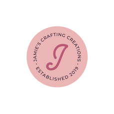
Jamie was looking for a refreshed visual identity to kick off the new year for her crafting business, and she wanted something that would reflect her style and personality. Using responses from her branding questionnaire, I created a mood board to inform the direction of the logo designs and color palette. In the primary logo, I incorporated a visual that represents a wooden tassle often used in the flat lays of Jamie's products. The end of the tassle also resembles the end of a paint brush, signifying the handmade quality of her work. The logo suite and colors are now applied across all print and digital marketing materials, creating a cohesive and recognizable brand.
PROJECT:
Branding
PRIMARY LOGO

COLOR PALETTE

LOGO VARIATIONS

bottom of page


